Niri Plus / Desktop guide
Neutral Slate
Neutral Slate pairs warm-charcoal UI surfaces with a pure-black workspace and Balanced+ terminal. Clear Blue marks focus and selection; status colors and normal/bright terminal pairs stay distinct. Noto Sans UI and Meslo terminal typography remain.
This identity is installed on Carbon, Starship and Snap through components 0.4.3. The deployment record distinguishes installed checks from physical display and normal-use acceptance. The gallery below uses sample content.
The contrast study retains the preceding desktop baseline and terminal comparisons. Balanced+ and the crisper desktop are selected; the other terminal options remain references.
Capturing the desktop
Current showcase videos and stills use 1280×800 at compositor scale 1; Chrome uses 125% browser zoom. The smaller native desktop makes interface text readable while keeping both working halves and the surrounding desktop in view. Images preserve their complete frame and native aspect ratio. Use the full-size image or video controls for closer reading. Earlier capture and qualification records retain their original dimensions.
Direct device controls
The interactive controls illustration shows Network, Audio and Bluetooth in the shared Plus frame: green current device framing, independent blue keyboard selection, explicit state labels, and an action strip separated from status. The illustration uses fictional, stateful sample devices. The controls recipe explains the native focused-device workflow and its current acceptance boundary.
Desktop overview
The browser and terminal share the screen over an opaque black background, with the focused window marked by a clear border. There is no permanent bar. This HTML/CSS composition uses sample content.
FIELD NOTES / 01
A place to read.
A place to build.
References, notes, and the next thing to try.
~/projects/a-small-idea
❯ niri validate
✓ Configuration is valid.
Which profile owns display layout?
Kanshi owns the output profiles.
❯
The frame below shows the current desktop running in the staged Arch reference: Chrome on the Niri Plus homepage beside Kitty/Zsh, with a black workspace and the selected native theme. The terminal uses a clean public sample project. Watch the desktop overview or explore the earlier browser/files, terminal, and information/clipboard recordings.
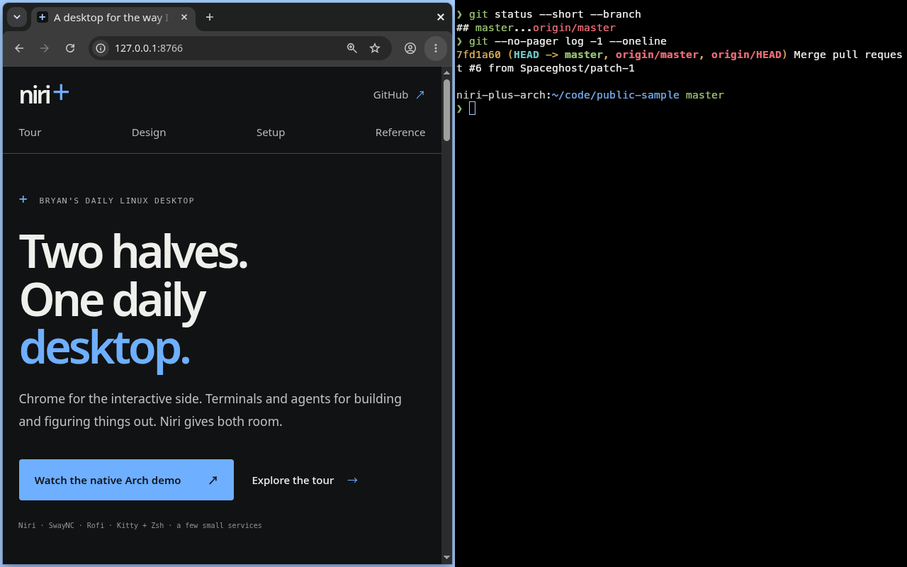
Native 1280×800 staged Arch guest · components 0.4.3 · Chrome 125% browser zoom · compositor scale 1. Open full-size capture · Capture details and review status.
Surface gallery
Inspect Launch, Information, Terminal, and Login/lock. The examples show a selected row, named picker actions, panel hardware states, a terminal selection, and transient feedback. All values are fictional, and controls change these illustrations only. Readable content remains available without JavaScript.
01 / Launch
Find it. Choose an action.
Rofi · sample rows and local controls
Sample selection: Codex on Workstation. No session is opened.
02 / Information
Useful while the panel is open.
SwayNC · fictional live-looking values
System
Network
Bluetooth
Battery
KITTY · SAMPLE NOTIFICATION
Build completeReturn to the originating window.
Retained card · example action onlyWHEN HARDWARE IS ABSENT
GPU asleep: GPU rows stay hidden.
Desktop without a battery: the Battery card hides.
Unknown device charge: show “—”; do not guess.
Feedback: brief, replaceable, and kept out of history.
03 / Terminal
The palette keeps its meaning.
Kitty · MesloLGS Nerd Font · 11pt
14:32:07 · CPU 3% · RAM 24%
workstation ~/code/a-small-idea main
❯ git status --short
✓ working tree clean · no pending changes
A selected terminal line stays readable.
Bold emphasis dim suggestion ! warning × error
Latin / 中文 / Nerd glyphs:
❯
The 16-color strip is generated from the selected identity. Full-screen tools and explicit RGB syntax keep their own colors.
04 / Login and lock
Quiet, neutral authentication.
SDDM + Gtklock · appearance mockup
SDDM · LOGIN MOCKUP
Authentication failed · sample state only
GTKLOCK · LOCK MOCKUP
Illustrations only. No credentials are requested or checked, and the desktop is not locked or unlocked.
Palette
The workspace background uses #000000. The overview places those black
workspaces against a charcoal #111213 surround, keeping empty workspace
boundaries visible. UI canvas, panels and raised controls retain their own
warm-charcoal roles. Login and lock surfaces retain their neutral secure palette.
The desktop palette names each color's job. The terminal has independent background, foreground, cursor, selection, and sixteen ANSI values. Its error, success, warning, and blue families relate to the desktop without sharing exact values. Normal and bright entries have deliberate shade separation.
#000000#111213#111213#1b1d1f#303336#111315#81878c#454b50#efefec#c9cbc8#aaaeac#6eafff#111315#a6ceff#294e75#efefec#a9d180#e9b55f#f27d78#c8b9d6#202020#303030#d0d0d0Balanced+ terminal
Independent terminal framing on pure black, followed by all sixteen ANSI slots.
#000000#efefec#a6ceff#111315#294e75#efefec#000000#e76c75#99c070#deb05c#74aae9#ba92d4#6ec0c3#c8ccc9#838c8f#f7a0a4#c4e39d#f8d895#a7cefc#ddbcf3#abe1e1#f8f8f6Typography and details
Noto Sans is used for UI text; MesloLGS Nerd Font keeps terminal characters and symbols together. Source Han Sans CN is the CJK fallback. The specimen shows Latin, Chinese, terminal glyphs, selected text, and the shared spacing and focus details. It illustrates the selected design; native toolkit rendering can vary.
UI / REGULAR / 11PT
Noto SansRead a long label without losing the selected action.
Secondary text · 10pt · Bluetooth keyboard with a longer device name
Group title · medium / 13pt
English · 中文 · 開発ワークスペース
TERMINAL / REGULAR / 11PT
MesloLGS Nerd Font ~/code/niri-plus main
❯ fc-match 'Noto Sans'
Noto Sans Regular
✓ → glyph coverage sample
中英混排 · Source Han fallback- CJK fallback
- Source Han Sans CN
- Icons / cursor
- Breeze Dark · Breeze cursors · 24 logical pixels
- Geometry
- Square outer windows · 4px gap and focus ring · 4/8/12/16/24/32px spacing
- Authentication
- Neutral surface, input, and button colors; native login and lock behavior stay in their owners.
Use the theme
The selected identity profile source generates the public identity export, the site's appearance CSS, palette specimen, and the Neutral Slate Kitty fragment. The appearance recipe links to frozen Niri, Rofi, SwayNC, Gtklock, Qt, and KDE examples. They contain appearance settings only; Kitty input, paste, glyph, session behavior, and other component actions retain their existing owners.
Start with the setup guide, then use the Kitty and Zsh guide for terminal colors and typography. The architecture guide and desktop reference describe component ownership and everyday entry points. The gallery is a design specimen and does not claim to be a recording of the deployed desktop.